Top Ten Tuesday : Anticipated Reading List
 29 June 2021
Filed under Book Reviews
Tags: Anticipated reading, My tbr second half of the year, That Artsy Reader Girl, Top Ten Tuesday


Top Ten Tuesday is a weekly meme where every Tuesday we look at a particular topic for discussion and use various (or more to the point ten) bookish examples to demonstrate that particular topic. Top Ten Tuesday (created and hosted by The Broke and Bookish) is now being hosted by That Artsy Reader Girl and future week’s topics can be found here. This week’s topic :
Most Anticipated Releases of the Second Half of 2021
Okay, so I recently posted for TTT books I’d be reading for summer – which you can find here. Today I’m going to look at some of the other books on my shelves that I’m looking forward to picking up, these basically continue where my summer reads left off. (Obviously I’m also looking forward to more of my SPFBO books but I will be posting about those separately.
- Paper and Blood by Kevin Hearne
- The Pariah by Anthony Ryan
- Empire of the Vampire by Jay Kristoff (Sampler)
- The House of Dust by Noah Broyles
- Once Upon a Broken Heart by Stephanie Garber
- Comfort Me With Apples by Catherynne M. Valente
- Midnight in Everwood by M.A. Kuzniar
- The Hidden by Melanie Golding
- All of Us Villains by Christine Herman; Amanda Foody
- Survive the Night by Riley Sager


So, what’s on your list this week?
#SPFBO Review : One of Us, The City of Secrets by ML Roberts
28 June 2021
Filed under Book Reviews
Tags: #SPFBO, ML Roberts, One of Us, The City of Secrets

One of Use by ML Roberts was the fourth book I read this month as part of the SPFBO Competition. My three other books as part of Batch One were Deathborn by CE Page, Graves Robbed, Heirlooms Returned by Ashley Capes and Stranded by Rosalind Tate. At the end of the month I will be posting an update and highlighting which book or books will be rolled forward and which will be cut.
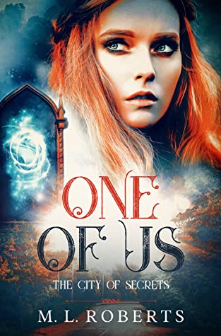
So, I would briefly describe One of Us as YA high school/urban fantasy. Mostly set within the school grounds it involves a young girl who starts to think her imagination is playing tricks on her.
The story is told by Olivia, fifteen years of age (I think). Her mum asks her a favour, to befriend the daughter of one of her clients who has recently moved to the area and is new to school. Of course, being 15, and not even as part of the in-crowd, choosing friends based on your parents’ wishes doesn’t do anything for your social standing.
Olivia’s best friend is Mindy, they’re fairly average students, not the popular girls, not particularly sporty or clever, but doing okay. Abigail stands out a little bit, for all of the wrong reasons, and Olivia tries to avoid bumping into her at all. Pamela is one of the ‘super popular’ girls and incredibly mean. She seems to have made it her own mission in life to make the new girl’s life hell. This aspect of the story is very ‘mean girls’ until, unexpectedly, revenge becomes the dish of the day.
On top of skirting around trying to avoid other students Olivia has plenty of other things on her mind. She spotted a story in a news article saying that a local boy (who Olivia knows and used to go to the same school) has died in a surfing or swimming accident. Olivia is distraught by the news but soon starts to suspect that she imagined the story. The article seems to have disappeared and nobody at the school seems to be aware. At the same time we are shown a memory of Olivia and her brother out driving when a strange occurrence takes place. The car is hit by an object, Olivia’s brother thinks a branch, Olivia on the other hand thinks she sees a man lying in the road, a man with long silver hair and wings. There are other strange occurences but I won’t go into them here. Then things escalate, starting at the high school dance, Abigail is attacked. We find out more strange news from Olivia’s flashbacks and there’s talk of a haunted house.
Now, my feelings on One of Us are a little mixed. I struggled to get into the story at first (although I did think the opening chapter was quite an intriguing hook). The early stages of the story felt very teenage angst-y and the dialogue felt clunky, there was a lot of wild speculation on the part of Olivia for almost everything and anything that happens and for perhaps half the book very little really took place other than glimpses of things that didn’t really add up to very much. As the story began to hot up the writing improved, to such an extent that I was intrigued and quite keen to read forward to discover what was going on. The pacing improved, in fact things became a little bit crazy, it felt almost like a Scooby Doo adventure at one point but with an all girl cast and absent Scooby – and witches and fae instead of wannabe criminals shaking their fists and muttering ‘if it wasn’t for those pesky kids’. I can’t deny that it was actually entertaining in a chaotic sort of way, not sure it was entirely realistic in some respects but it did keep me turning the pages. But, and yes, there is a but. I’m not sure even now what the motivations of the ‘evil ones’ was or what they were really trying to achieve. I have what feels like a sketchy understanding of things being hidden around the city, protected by Others using magic barriers and the like and also that there are those who want to access these hidden elements (creating unspeakable risks)- although I have very hazy notions of why that is at this point.
Criticisms aside, I think this would probably work well with the right audience. I think the high school vibe is well done, the insecurities and fear of being ostracised, the bullying, etc and there’s an adventure type feel to the direction the story took. I’m assuming that another book is planned although it isn’t clear at the present but this one definitely concludes with certain things remaining open not to mention talk of portals and the fact that Olivia may herself have something more to her than at first meets the eye..
I received a copy from the author, for which my thanks. The above is my own opinion.
Booking Ahead/Weekly Wrap Up
27 June 2021
Filed under Book Reviews
Tags: Booking Ahead, Caffeinated Reviewer, Weekly wrap up

I’m trying to get back into the habit of doing a round-up of the week just completed and also take a look at my plans for the forthcoming week. I rather got out of the habit of doing this last year but I would like to reinstate this type of post as I feel it keeps me on track. So, I’m linking up to The Sunday Post over at Kimberly’s Caffeinated Reviewer. Without further ado:
Last week:
This week I finished reading A Dark and Secret Place by Jen Williams. I also red The Rising Tide by Sam Lloyd and completed my third Discworld book – my buddy read with Lou’s Book Stuff. I also managed to squeeze in three book reviews and a guest post by Bjørn Larssen in which he discusses book covers for Children (The Ten Worlds #1). The description for which can be found here. Finally I made a start on The Empire’s Ruin by Brian Staveley.


Complete the Empire’s Ruin by Brian Staveley. Then I’m aiming to read The Final Girl Support Group by Grady Hendrix. Not sure about my other choice of book yet, possibly The 22 Murders of Madison May by Max Barry. I’m also aiming to review the fourth SPFBO book I read for June following which I will be posting a SPFBO update in which I will announce books cut or carried forward.


- For the Wolf (Wilderwood #1) by Hannah F Whitten
- Deathborn (Sovereigns of Bright and Shadow #1) by CE Page
- The Witness for the Dead by Katherine Addison


- Murder of Crows by Anne Bishop
- One of Us by ML Roberts
- Hyde by Craig Russell
- A Dark and Secret Place by Jen Williams
- The Rising Tide by Sam Lloyd
- Equal Rites by Terry Pratchett
#SPFBO Saturday : Guest post from Bjørn Larssen
26 June 2021
Filed under Book Reviews
Tags: #SPFBO, Bjorn Larssen, Book Covers, Guest post
As part of the SPFBO Competition each weekend I am hoping to post guest blog posts inviting authors taking part in the competition to visit my blog to either write an article, discuss covers, take part in an interview or post an excerpt or teaser for their work.
This weekend is my first visit and I’m really happy to be hosting a guest post submitted by Bjørn Larssen in which he discusses the thought processes that led him to come up with the wonderful cover we’re now familiar with. A cover that was also submitted into the SPFBO Cover Competition and won Silver place from the public vote. Bjørn is the author of Children (The Ten World #1). The description for which can be found here.
Firstly, I’d like to thank Bjørn for agreeing to take part and providing us with an insight into the amount of work that goes into putting together a successful cover.
***
Everything began with a shot of Meghan and Harry walking in front of photographers. Meghan, an actress, did the smiling and waving thing. Harry’s mouth formed a grimace, his best attempt at a smile. He gazed to the side, eyebrows furrowed. He was not holding Meghan’s hand; she held his.
Harry was never going to become King; he’d forever remain “the son of.” At best, potentially useful as a point of access to those who have actual power. He knew all that, saw no escape, knew this was going to be how the rest of his life would unfold, and he was terrified.
Magni, son of Thor, was neglected, cast away, ignored by his father. He was also a giant, flame-haired, bearded blacksmith who carried his favourite hammer around. He looked like the father he despised – and the last time he had seen Thor was when Thor had destroyed the town Magni and his mother lived in. Magni made a vow to become the opposite of Thor, rejecting everything his father stood for.
Someone like Magni could never be accepted as simply a strong man who likes working with iron though. He was not a person – but “the son of,” hated or loved at first sight, preconceptions about him made before it transpired he even had a name of his own. At best, potentially useful as a point of access to the “real” Gods. He knew all that, saw no escape, knew this was going to be how the rest of his life would unfold, and he was terrified.
I wanted Magni on the cover and now I knew what he should look like.
Portrait
Most covers of indie fantasy books are paintings. I had the blurb for the artist ready – here’s the photo. Give me those haunted eyes, the apprehension, add darkness and fire. I approached two artists whose earlier work I adored. When I received their price quotes, I slightly passed out. Those prices, when I thought about it, were completely reasonable, when compared with how much time and work it would take. But in order to afford their fees, I’d have to postpone the book by at least six months in order to save money.
The probability of me finding a model with red hair and beard, clad in medieval clothing, with that look in his eyes and the right facial expression, seemed near-zero. To my excited disbelief, I found him. I stared at the photos (there was a whole series!), picked one, bought it, and started working. The cover couldn’t just have Magni on it. It needed to convey the message “this is a Norse mythology retelling from the point of view of the son of Thor (pictured), oh, and despite the title it is also not at all suitable for children.”
I added layers – a flock of birds to represent Odin’s ravens; tree branches; fire. After consideration I took out the birds, because representing Odin’s two ravens using fifty or so bird silhouettes felt unclear even to me. I replaced the branches with an actual peek of a forest at night. Added more fire (when in doubt, always add more fire) for that fantasy je ne sais quoi. My inner graphic designer (I worked as one for nearly fifteen years) was delighted. As a reader, all I could tell was that it was a fantasy book that featured some bloke with green eyes. The only reason why I knew it had something to do with Norse Gods was that I wrote the book.
I tried various pseudo-runic fonts and cringed from here to New Zealand at how cheap they made the cover look. I changed the title to Children of the Gods, because Gods = possibly Norse Gods, might work. I showed the result to some people and all of them praised it – but they all already knew what the book was about.
But it was so pretty.
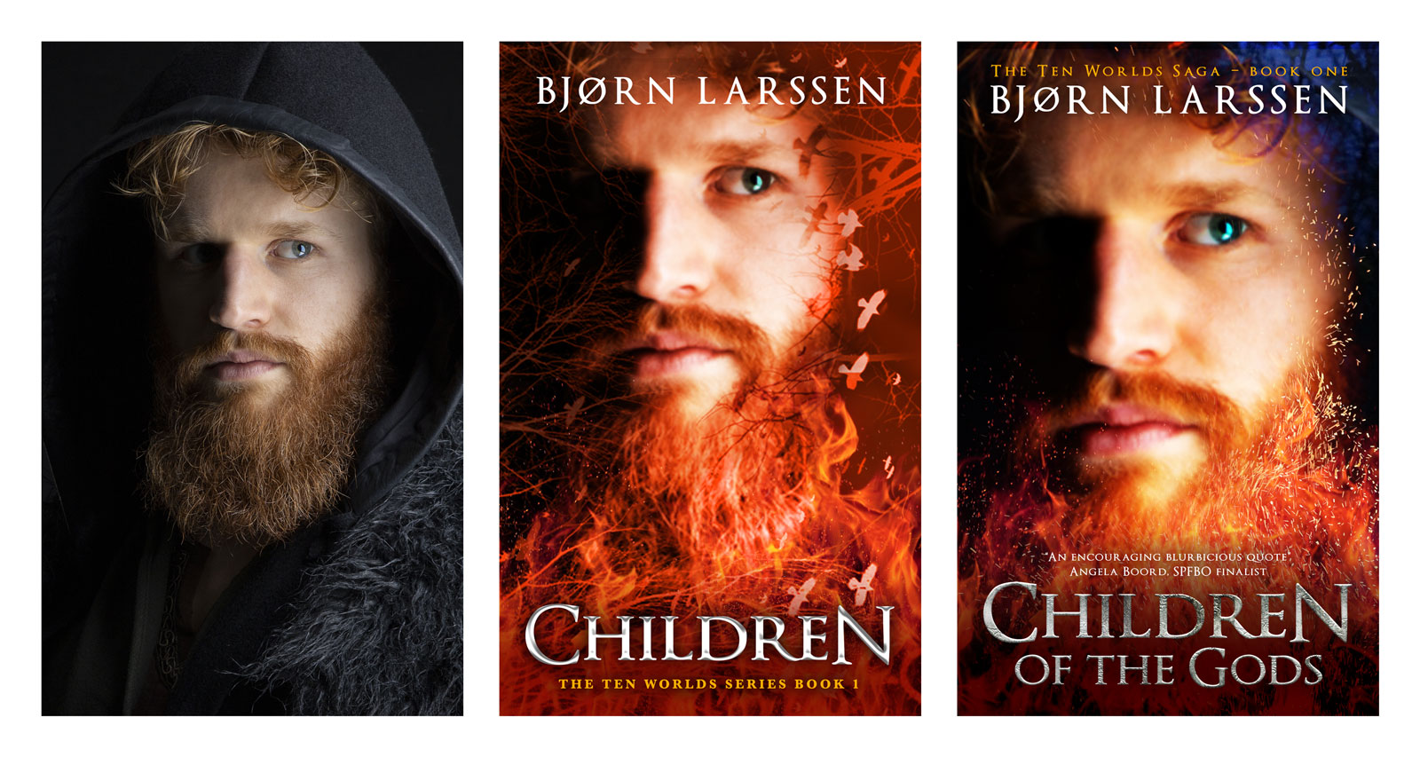 A few weeks before the release date a friend told me about a lengthy series of vaguely homophobic vampire erotica called Children of the Gods. Now I really had a branding disaster in my hands. Calling the book Children didn’t really explain what it was about, but getting it mixed up with a series of 46 (by now 51) vampire romances? The publishers of those had massive marketing budgets (and potentially a lawyer). My book would never appear in Amazon search above the 47th position. I was happy to go back to the original title – but now the cover again conveyed, without a doubt, that it contained a green-eyed man.
Trees
Children is the first book in The Ten Worlds series. I commissioned a logo for the series from Brad Bergman. It was supposed to appear on the spines and front covers, small, just for branding. When it arrived, I was blown away. It just fit, an illustration rather than a logo, Yggdrasil, the Tree of life, surrounded by clearly Norse symbols. I blew the logo up, placed it on a burgundy red background, made it golden, then replaced the gold with fire. (When in doubt…) The typography was simple, not to distract from the Tree. I barely bothered to say a quick “bye” to poor Magni.
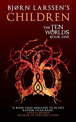
When the book came out, many of the reviewers couldn’t compliment the cover enough. It was a triumph. I loved it, the readers who followed me after Storytellers (my debut) loved it, and all seemed great until a stranger asked me what sort of book it was.
It didn’t occur to me that the reviewers were approached with the question “would you like to read a Norse mythology retelling from the point of view of the Gods’ children?” They knew what they were getting, they’ve read the blurb, and then they read the book. The readers who followed me knew what I was writing. A new potential buyer saw a (beautiful) drawing of a (burning?) tree on red background.
Hoping that it was a one-off, I asked other authors in a group I am a member of – what do you think this book is? I thought the problem was the typography and I needed to make it “more fantasy.” But most of those I polled answered “epic fantasy.” I got the genre right, but not the subgenre. I created a wonderful cover for some other book.
When I explained what it actually was, most people suggested putting Thor’s hammer on the cover. This didn’t work for multiple reasons. Children is the first book in a series. What would I do with the second or third? Multiple hammers? But the reason why they were mentioning Thor’s hammer was that they saw it on Neil Gaiman’s Norse Mythology. Which was why I couldn’t do it. It wouldn’t even look like an homage, just a shameless attempt to coat-tail on Gaiman’s success.
I decided to ask people who had read the book instead. What did they think it was? Their answers could be summed up with “a very dark Norse fairytale.” One of them used the word “grimdark.” No, I thought, confused. Grimdark was all about blood-dripping axes and burning battlefields and cackling warriors raping the daughters of their enemies, and so on. I knew that, because I had read two grimdark books. It turned out that they didn’t cover the entire genre.
The new brief I gave myself said: Grimdark. Norse. Fairytale.
I found the right typeface, Noatún – very different from the pseudo-runic hand-drawn letters, yet just Norse enough to clearly convey the message. Grimdark – no blood-dripping axes for me, but obviously saturated, bright colours were not right. It needed to be subdued. Fairytale – I browsed through many images until I decided on one. Yggdrasil, the Tree, stil fit, but it shouldn’t be pretty and fierce. Instead, I would use an image of a moss-covered tree in a foggy forest. I filtered, layered, worked on the photo until it no longer looked like a photo. The fog turned silver. Just to hammer (sorry) the message home, I added “A NORSE MYTHOLOGY RETELLING” under the title. There it was. My fitting, striking, informative cover.
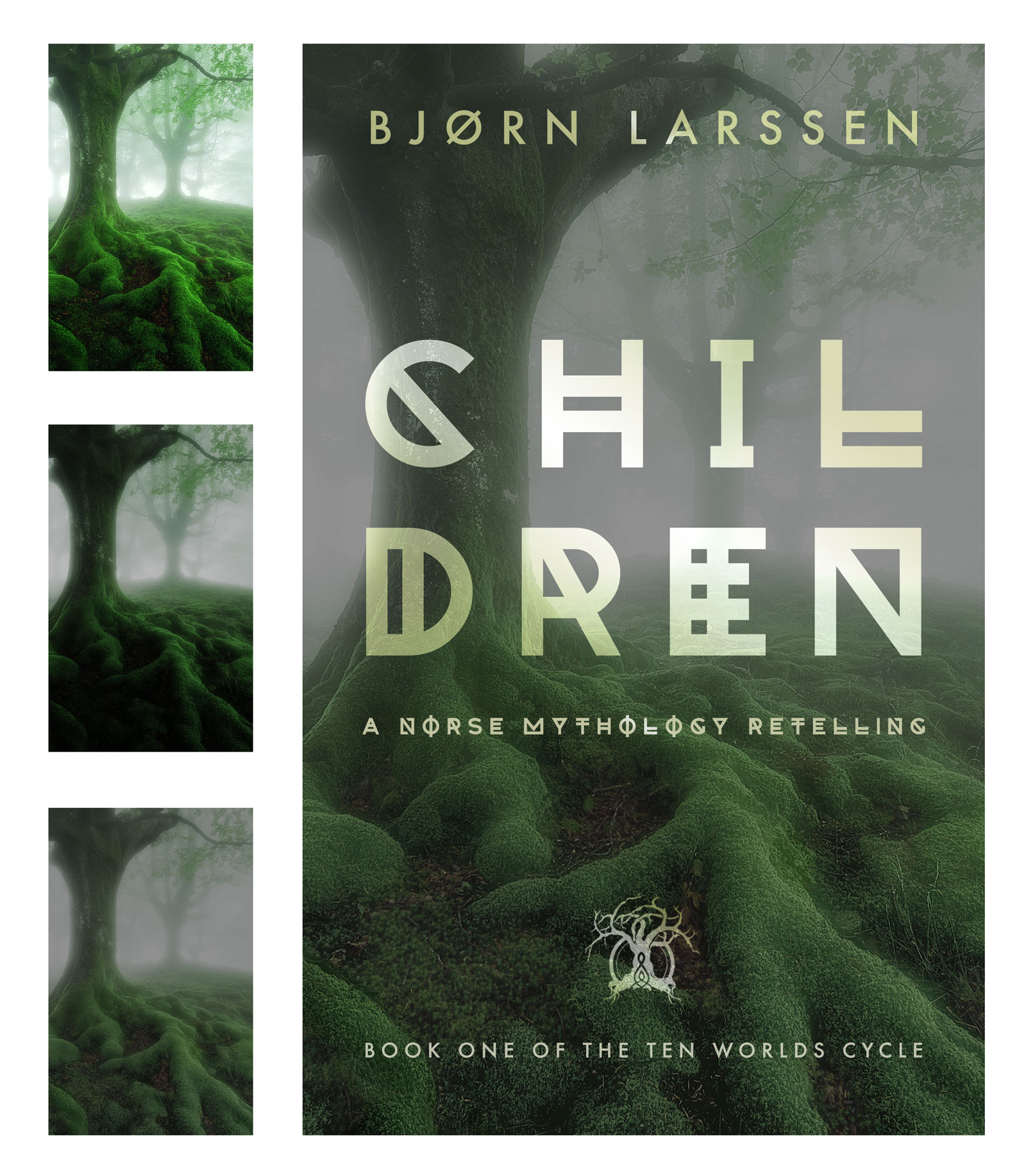 It killed the sales.
There are weeks when I sell more books, then fewer. But when I change nothing but the cover, the number drops to zero, and remains there, it’s easy to guess what the reason could be. I analysed the cover, trying to figure out what I’d done wrong this time. On the thumbnail, the “Norse Mythology Retelling” was illegible. Without that, potential readers saw a blurry, green tree. Their first thought was never going to be, “oh, this is very clearly a grimdark fairytale-like Norse mythology retelling.” I lost the attraction of the red “epic fantasy” tree and failed to convey what the book actually was – again. Oh boy, I thought. If I went with a painted portrait of Magni, I would now be commissioning the fourth painting.
Raven
Back to the photoshopping board we go. Again.
The blurb was fine, but the imagery wasn’t, so the image search and Amazon search became my best friends. Grimdark fantasy. Norse grimdark fantasy. Norse inspired fantasy. Books about Norse mythology. Heathenry symbols. Ásatrú symbols. Viking symbols.
The list I already had seemed, sadly, quite complete. Apart from Odin’s eyepatch I only added Sleipnir, Odin’s eight-legged horse – who makes a brief appearance indeed – and Odin’s ravens, Huginn and Muninn.
In the book, ravens are mostly present because of their absence. My characters’ paranoia about being potentially watched by or listened to by Odin’s ravens is justified. Huginn and Muninn are an extension of Odin; the all-seeing-eyes that might be near… or not. Menacing, dark, fairytale-like – if that fairytale was written by Brothers Grimm on a really cloudy day.
I chose blue that was simultaneously saturated and subdued, moving from fire to ice. The colour was both striking and cold. I added layers of trees, but not pretty, green trees; dark and menacing. The raven himself is a painting I luckily didn’t have to commission. Once I added firefly-like lights, I tested it on a few more people who haven’t read the book, and sighed with relief.

The final (for now) cover couldn’t possibly be more different from what I started with. This one, however, works. And I got another reminder, or three, that cover design is a very different form of art from graphic design.
***
Thanks so much for visiting today, I loved reading about your own book cover journey and hope everyone else does too.
Friday Face Off : Upside down, back to front or topsy turvy
25 June 2021
Filed under Book Reviews
Tags: back to front or topsy turvy, Books by Proxy, Friday Face off, I Am Behind You, John Ajvide Lindqvist., Platserna #1, Upside down

Here we are again with the Friday Face Off meme created by Books by Proxy . This is a great opportunity to feature some of your favourite book covers. The rules are fairly simple each week, following a predetermined theme (list below) choose a book (this doesn’t have to be a book that you’ve read), compare a couple of the different covers available for that particular book and choose your favourite. Future’s themes are listed below – if you have a cover in mind that you’re really wanting to share then feel free to leave a comment about a future suggested theme. I’ve also listed events that take place during the year, that I’m aware of, so you can link up your covers – if you’re aware of any events that you think I should include then give me a shout.
This week’s theme:
Upside down, back to front or topsy turvy
So, I had a few covers in mind for this week’s theme, of course, not all of them had alternative covers so I’ve gone for I am Behind You (Platserna #1) by John Ajvide Lindqvist. I’ve read a couple of his books and they be scary! I don’t want to ever upset this guy because he has got some imagination going on. Seriously, though, this book, and I Always Find you – wow, mind blown in the most wicked, horror soaked way:


My favourite this week
Difficult to choose because these covers give me the chills but I’ve gone for two – I love the second image with the upside down caravan – it actually does my head in! But that image with the green scare the bejesus out of me and I can’t even say why, it just does:


I’ve updated the list now to include themes for next year. If you know of an event that’s coming up let me know and I’ll try and include covers that work for the event itself so that you can link up to the Friday Face Off and, as always, if you wish to submit an idea then leave me a comment – or if you’d like to host a week then simply let me know. Also, I would just mention that it’s very possible that some of these might be repeats from previous FFOs although I have tried to invent more ‘open ended’ prompt that can be interpreted differently and also prompts that relate to emotions. Finally, don’t struggle with any of these, this is meant to be a fun way of highlighting books. If you can’t come up with a book you think fits for a particular week use a freebie – perhaps a recent read for example:
Next week – A book with a landscape you’d like to visit
2021
July
2nd – A book with a landscape you’d like to visit
9th – A Wicked Grin
16th – Books with ‘book’ in the title
23rd – A Black Hole – could be in the universe or going deep into the ground
30th – Chaos – maybe too much going on in this one
August
6th – “They cluck their thick tongues, and shake their heads and suggest, os so very delicately!” – The Motel
13th – A favourite holiday read
20th – Dressed to kill (could be literally someone dressed to kill, or someone dressed up for a big night out
27th – Sunbathing or on the beach
September (RIP event)
3rd – 1920s feel, noir detective
10th – I’m Henry the Eighth I am – let’s look at Kings or other Emperors/rulers
17th – Books with ‘Murder’ in the title
24th – A favourite thriller
October
1st – A Halloween read
8th – Chills – anything at all that almost makes you too scared to pick up the book (your own pet hate)
15th – Your favourite book of magic
22nd – Books with ‘Queen’ in the title
29th – Must be gothic
November – Sci Fi Month
5th – Your earliest sci-fi read or the first sci-fi you reviewed
12th – A book with ‘star’ in the title
19th – Futuristic vista
26th – A Black Hole – in the universe or going deep into the ground
December
3rd – Windswept, the classic figure, stood majestically, with wind blowing out in a fetching way
10th – A fairytale retold
17th – Winter Solstice approaching – anything cold and seasonal
24th – All things fire – red hair, red covers, fire breathing dragons, simply fire?
31st – What’s your catnip – if it’s on a cover you have to pick it up


