Friday Face Off: Fateless by Julie Kagawa
 12 December 2025
Filed under Book Reviews
Tags: Book Covers, Fateless, Friday Face off, Julie Kagawa


Today I’m returning to the Friday Face Off, originally created by Books by Proxy). I’ve missed these for the past few months and so would like to get back to comparing covers (and hopefully I will be updating this page with a new banner. This is an opportunity to look at a book of your choice and shine the spotlight on the covers. Of course this only works for those books that have alternative covers (although sometimes I use this to look at a series of books to choose a favourite). So, if you have a book that has alternative covers, highlight them and choose your favourite. If you’re taking part it would be great if you leave a link so I can take a look at what you’ve chosen.
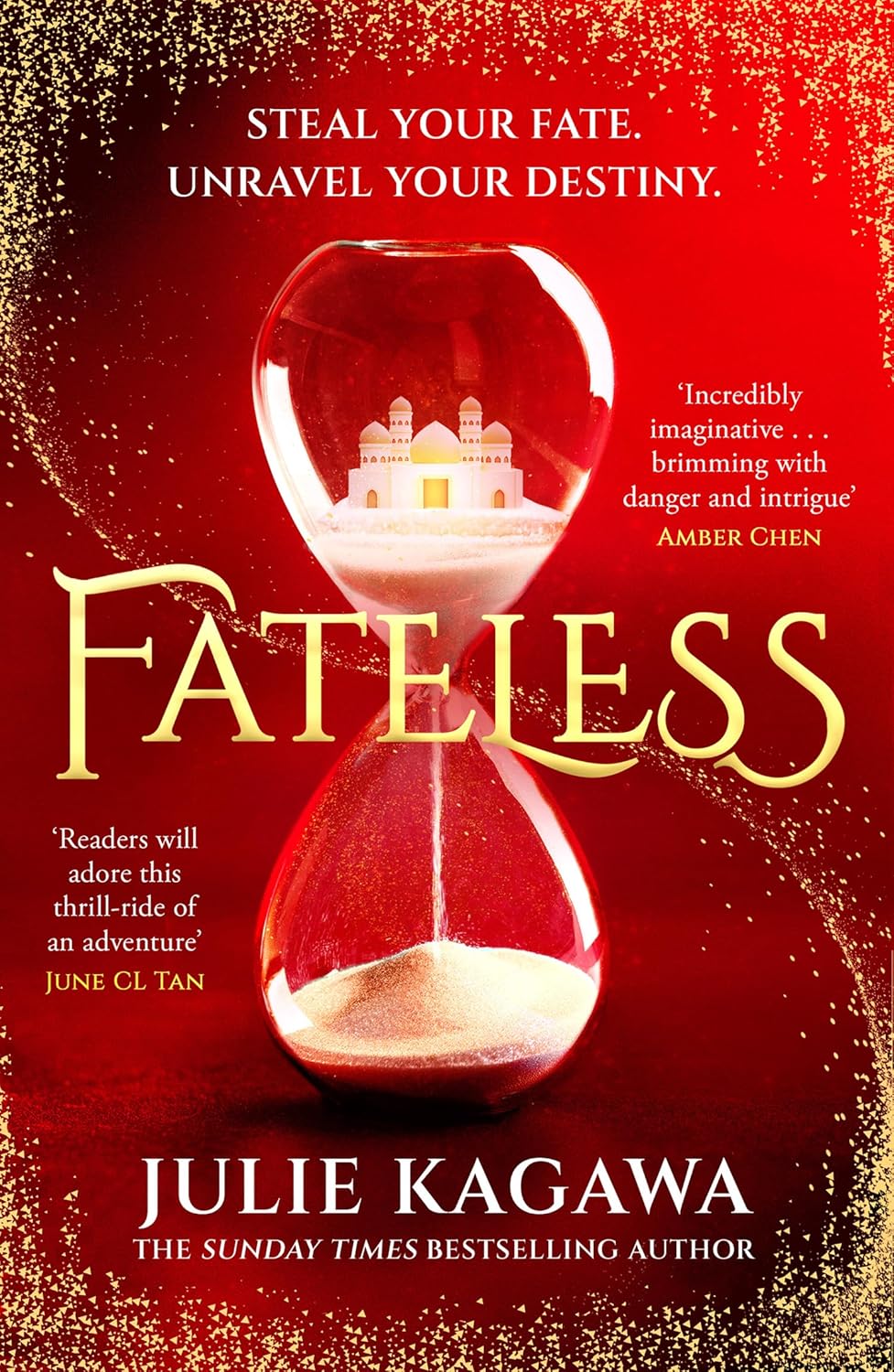
This week I’ve chosen a book that I read earlier this year. Fateless by Julie Kagawa (No.1 in the Fateless series).
Here are the covers:
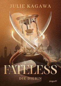
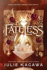
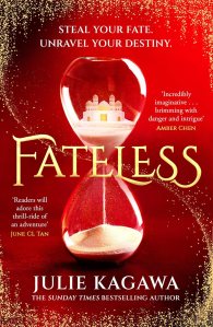
My favourite
Which is your favourite this week?
Friday Face Off : The Devils by Joe Abercrombie
2 August 2024
Filed under Book Reviews
Tags: Book Covers, Fantasy Fiction, Friday Face off, Joe Abercrombie, The Devils, Upcoming Book Releases
Today I’m returning to the Friday Face Off, originally created by Books by Proxy). I’ve missed these for the past few months and so would like to get back to comparing covers (and hopefully I will be updating this page with a new banner. This is an opportunity to look at a book of your choice and shine the spotlight on the covers. Of course this only works for those books that have alternative covers (although sometimes I use this to look at a series of books to choose a favourite). . So, if you have a book that has alternative covers, highlight them and choose your favourite. If you’re taking part it would be great if you leave a link so I can take a look at what you’ve chosen.
This week I’ve chosen a book that I’m really excited about by a favourite author. This is a book that isn’t released yet but Ioved the covers when I saw them and so wanted to share. The Devils by Joe Abercrombie. Here are the covers:
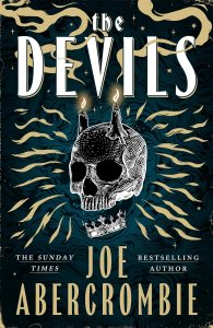

My favourite this week:
I actually can’t choose a favourite this week because I really like both. The dark cover with the red skull really appeals to me, it’s very ominous and the lit candles really pop. But, the lighter elements to the first cover make it much easier to spot extra little details that disappear into the darkness a little with the second. So, I’m undecided, both covers would definitely grab my attention without any doubt.
Which is your favourite?
Join me next week in highlighting one of your reads with different covers.
Friday Face Off : Heads Will Roll by Josh Winning
24 May 2024
Filed under Book Reviews
Tags: Book Covers, Friday Face off, Heads Will Roll, Josh Winning
Today I’m returning to the Friday Face Off, originally created by Books by Proxy). I’ve missed these for the past few months and so would like to get back to comparing covers (and hopefully I will be updating this page with a new banner. This is an opportunity to look at a book of your choice and shine the spotlight on the covers. Of course this only works for those books that have alternative covers (although sometimes I use this to look at a series of books to choose a favourite). . So, if you have a book that has alternative covers, highlight them and choose your favourite. If you’re taking part it would be great if you leave a link so I can take a look at what you’ve chosen.
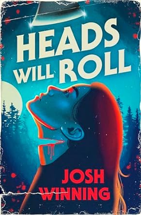
This week I’ve chosen a book that I’m looking forward to reading in the next few weeks. Heads Will Roll by Josh Winning.


Which is your favourite?
Join me next week in highlighting one of your reads with different covers.
#SPFBO Saturday : Guest post from Bjørn Larssen
26 June 2021
Filed under Book Reviews
Tags: #SPFBO, Bjorn Larssen, Book Covers, Guest post

As part of the SPFBO Competition each weekend I am hoping to post guest blog posts inviting authors taking part in the competition to visit my blog to either write an article, discuss covers, take part in an interview or post an excerpt or teaser for their work.
This weekend is my first visit and I’m really happy to be hosting a guest post submitted by Bjørn Larssen in which he discusses the thought processes that led him to come up with the wonderful cover we’re now familiar with. A cover that was also submitted into the SPFBO Cover Competition and won Silver place from the public vote. Bjørn is the author of Children (The Ten World #1). The description for which can be found here.
Firstly, I’d like to thank Bjørn for agreeing to take part and providing us with an insight into the amount of work that goes into putting together a successful cover.
***
Everything began with a shot of Meghan and Harry walking in front of photographers. Meghan, an actress, did the smiling and waving thing. Harry’s mouth formed a grimace, his best attempt at a smile. He gazed to the side, eyebrows furrowed. He was not holding Meghan’s hand; she held his.
Harry was never going to become King; he’d forever remain “the son of.” At best, potentially useful as a point of access to those who have actual power. He knew all that, saw no escape, knew this was going to be how the rest of his life would unfold, and he was terrified.
Magni, son of Thor, was neglected, cast away, ignored by his father. He was also a giant, flame-haired, bearded blacksmith who carried his favourite hammer around. He looked like the father he despised – and the last time he had seen Thor was when Thor had destroyed the town Magni and his mother lived in. Magni made a vow to become the opposite of Thor, rejecting everything his father stood for.
Someone like Magni could never be accepted as simply a strong man who likes working with iron though. He was not a person – but “the son of,” hated or loved at first sight, preconceptions about him made before it transpired he even had a name of his own. At best, potentially useful as a point of access to the “real” Gods. He knew all that, saw no escape, knew this was going to be how the rest of his life would unfold, and he was terrified.
I wanted Magni on the cover and now I knew what he should look like.
Portrait
Most covers of indie fantasy books are paintings. I had the blurb for the artist ready – here’s the photo. Give me those haunted eyes, the apprehension, add darkness and fire. I approached two artists whose earlier work I adored. When I received their price quotes, I slightly passed out. Those prices, when I thought about it, were completely reasonable, when compared with how much time and work it would take. But in order to afford their fees, I’d have to postpone the book by at least six months in order to save money.
The probability of me finding a model with red hair and beard, clad in medieval clothing, with that look in his eyes and the right facial expression, seemed near-zero. To my excited disbelief, I found him. I stared at the photos (there was a whole series!), picked one, bought it, and started working. The cover couldn’t just have Magni on it. It needed to convey the message “this is a Norse mythology retelling from the point of view of the son of Thor (pictured), oh, and despite the title it is also not at all suitable for children.”
I added layers – a flock of birds to represent Odin’s ravens; tree branches; fire. After consideration I took out the birds, because representing Odin’s two ravens using fifty or so bird silhouettes felt unclear even to me. I replaced the branches with an actual peek of a forest at night. Added more fire (when in doubt, always add more fire) for that fantasy je ne sais quoi. My inner graphic designer (I worked as one for nearly fifteen years) was delighted. As a reader, all I could tell was that it was a fantasy book that featured some bloke with green eyes. The only reason why I knew it had something to do with Norse Gods was that I wrote the book.
I tried various pseudo-runic fonts and cringed from here to New Zealand at how cheap they made the cover look. I changed the title to Children of the Gods, because Gods = possibly Norse Gods, might work. I showed the result to some people and all of them praised it – but they all already knew what the book was about.
But it was so pretty.
 A few weeks before the release date a friend told me about a lengthy series of vaguely homophobic vampire erotica called Children of the Gods. Now I really had a branding disaster in my hands. Calling the book Children didn’t really explain what it was about, but getting it mixed up with a series of 46 (by now 51) vampire romances? The publishers of those had massive marketing budgets (and potentially a lawyer). My book would never appear in Amazon search above the 47th position. I was happy to go back to the original title – but now the cover again conveyed, without a doubt, that it contained a green-eyed man.
Trees
Children is the first book in The Ten Worlds series. I commissioned a logo for the series from Brad Bergman. It was supposed to appear on the spines and front covers, small, just for branding. When it arrived, I was blown away. It just fit, an illustration rather than a logo, Yggdrasil, the Tree of life, surrounded by clearly Norse symbols. I blew the logo up, placed it on a burgundy red background, made it golden, then replaced the gold with fire. (When in doubt…) The typography was simple, not to distract from the Tree. I barely bothered to say a quick “bye” to poor Magni.
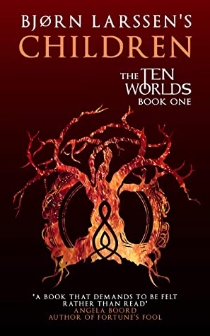
When the book came out, many of the reviewers couldn’t compliment the cover enough. It was a triumph. I loved it, the readers who followed me after Storytellers (my debut) loved it, and all seemed great until a stranger asked me what sort of book it was.
It didn’t occur to me that the reviewers were approached with the question “would you like to read a Norse mythology retelling from the point of view of the Gods’ children?” They knew what they were getting, they’ve read the blurb, and then they read the book. The readers who followed me knew what I was writing. A new potential buyer saw a (beautiful) drawing of a (burning?) tree on red background.
Hoping that it was a one-off, I asked other authors in a group I am a member of – what do you think this book is? I thought the problem was the typography and I needed to make it “more fantasy.” But most of those I polled answered “epic fantasy.” I got the genre right, but not the subgenre. I created a wonderful cover for some other book.
When I explained what it actually was, most people suggested putting Thor’s hammer on the cover. This didn’t work for multiple reasons. Children is the first book in a series. What would I do with the second or third? Multiple hammers? But the reason why they were mentioning Thor’s hammer was that they saw it on Neil Gaiman’s Norse Mythology. Which was why I couldn’t do it. It wouldn’t even look like an homage, just a shameless attempt to coat-tail on Gaiman’s success.
I decided to ask people who had read the book instead. What did they think it was? Their answers could be summed up with “a very dark Norse fairytale.” One of them used the word “grimdark.” No, I thought, confused. Grimdark was all about blood-dripping axes and burning battlefields and cackling warriors raping the daughters of their enemies, and so on. I knew that, because I had read two grimdark books. It turned out that they didn’t cover the entire genre.
The new brief I gave myself said: Grimdark. Norse. Fairytale.
I found the right typeface, Noatún – very different from the pseudo-runic hand-drawn letters, yet just Norse enough to clearly convey the message. Grimdark – no blood-dripping axes for me, but obviously saturated, bright colours were not right. It needed to be subdued. Fairytale – I browsed through many images until I decided on one. Yggdrasil, the Tree, stil fit, but it shouldn’t be pretty and fierce. Instead, I would use an image of a moss-covered tree in a foggy forest. I filtered, layered, worked on the photo until it no longer looked like a photo. The fog turned silver. Just to hammer (sorry) the message home, I added “A NORSE MYTHOLOGY RETELLING” under the title. There it was. My fitting, striking, informative cover.
 It killed the sales.
There are weeks when I sell more books, then fewer. But when I change nothing but the cover, the number drops to zero, and remains there, it’s easy to guess what the reason could be. I analysed the cover, trying to figure out what I’d done wrong this time. On the thumbnail, the “Norse Mythology Retelling” was illegible. Without that, potential readers saw a blurry, green tree. Their first thought was never going to be, “oh, this is very clearly a grimdark fairytale-like Norse mythology retelling.” I lost the attraction of the red “epic fantasy” tree and failed to convey what the book actually was – again. Oh boy, I thought. If I went with a painted portrait of Magni, I would now be commissioning the fourth painting.
Raven
Back to the photoshopping board we go. Again.
The blurb was fine, but the imagery wasn’t, so the image search and Amazon search became my best friends. Grimdark fantasy. Norse grimdark fantasy. Norse inspired fantasy. Books about Norse mythology. Heathenry symbols. Ásatrú symbols. Viking symbols.
The list I already had seemed, sadly, quite complete. Apart from Odin’s eyepatch I only added Sleipnir, Odin’s eight-legged horse – who makes a brief appearance indeed – and Odin’s ravens, Huginn and Muninn.
In the book, ravens are mostly present because of their absence. My characters’ paranoia about being potentially watched by or listened to by Odin’s ravens is justified. Huginn and Muninn are an extension of Odin; the all-seeing-eyes that might be near… or not. Menacing, dark, fairytale-like – if that fairytale was written by Brothers Grimm on a really cloudy day.
I chose blue that was simultaneously saturated and subdued, moving from fire to ice. The colour was both striking and cold. I added layers of trees, but not pretty, green trees; dark and menacing. The raven himself is a painting I luckily didn’t have to commission. Once I added firefly-like lights, I tested it on a few more people who haven’t read the book, and sighed with relief.

The final (for now) cover couldn’t possibly be more different from what I started with. This one, however, works. And I got another reminder, or three, that cover design is a very different form of art from graphic design.
***
Thanks so much for visiting today, I loved reading about your own book cover journey and hope everyone else does too.
Friday Face Off : ‘Remember, remember the fifth of November,’
2 November 2018
Filed under Book Reviews
Tags: Book Covers, Books by Proxy, Friday Face off

Here we are again with the Friday Face Off meme created by Books by Proxy . This is a great opportunity to feature some of your favourite book covers. The rules are fairly simple each week, following a predetermined theme (list below) choose a book, compare a couple of the different covers available for that particular book and choose your favourite. Future week’s themes are listed below – the list has been updated to help out those of you who like to plan ahead – if you have a cover in mind that you’re really wanting to share then feel free to leave a comment about a future suggested theme. This week’s theme:
‘Remember, remember the fifth of November,’ – A cover inspired by Bonfire Night (i.e. Guy Fawkes, Gunpowder Plot – think fires, fireworks, historical)
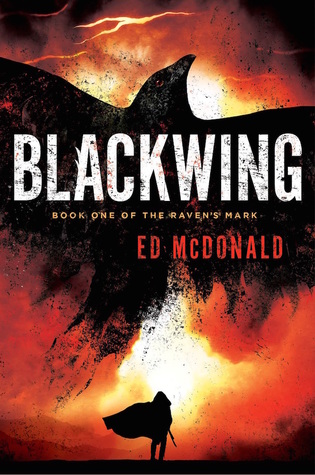
I thought I would have had more books to choose from with a fire theme but I’ve already used a couple in the past and didn’t want to reuse them so I’ve gone this time for Blackwing (Raven’s Mark #1) by Ed McDonald:


The first cover really fits the theme this week – it looks like a fire is blazing at the back of the character and it almost has the appearance of black ash raining down upon him. My favourite:
Like last week I’ve added a Mr Linky here so that you can leave a link if you wish or please leave me a link in the comments so I can visit and check out your covers. Thanks
Next week – a cover featuring a critter of the eight legged variety
Future themes: (if you’re struggling with any of these themes then use a ‘freebie’ of one of your favourite covers)
9th November – ‘All right! They’re spiders from Mars! You happy?’ – A cover featuring a critter of the eight legged variety
16th November – There is no terror in the bang, only in the anticipation of it.’ – A scary cover
23rd November – ‘The child is in love with a human. And not just any human. A prince!’ – A cover featuring a mermaid/man
30th November – “..the children of the night. What music they make!” – a cover with a vampire
7th December – ‘I am Aragorn son of Arathorn; and if by life or death I can save you, I will.’ – A cover featuring a hero
14th December -“Heavy is the head that wears the crown” – A cover featuring a crown
21st December – ‘ho, ho, ho’ – A seasonal cover
28th December – A freebie – choose one of your favourite titles and compare the covers
2019
4th January – A cover that is fresh – New beginnings for a New Year
11th January – ‘I know I have the body of a weak and feeble woman, but I have the heart and stomach of a king’ – A cover that depicts a novel set in the Tudor period
18th January – A cover featuring an Amulet – either in the cover or title
25th January – ‘Be kind whenever possible. It is always possible.’ – A cover featuring a monk/priest/person of the cloth
1st February – A comedy cover
8th February – ‘Hi little cub. Oh no, don’t be ssscared.’ – A cover with snakes
15th February – A heart – for Valentine’s day past
22nd February – “Woe, destruction, ruin, and decay; the worst is death and death will have his day.” – A cover with abandoned building/s
1st March – ‘who will buy this wonderful morning’ – A cover featuring a shop or market
8th March – ‘Two little fishes and a momma fishy too’ – A cover featuring a fish/fishes or other sea creatures
15th March – ‘Beware the moon, lads.’ – A cover with a shapeshifter
22nd March – ‘A horse, a horse, my kingdom for a horse’ – A cover featuring a king
29th March – “I thought unicorns were more . . . Fluffy.” – A cover featuring a unicorn
5th April – ‘nomad is an island’ – A cover featuring a desert landscape
12th April – ‘Odin, Odin, send the wind to turn the tide – A cover featuring a longboat
19th April – ‘It was the best of times, it was the worst of times – A cover featuring a school


