Friday Face Off : A Cover Bursting with Detail
 25 September 2020
Filed under Book Reviews
Tags: A Busy Cover, Books by Proxy, Friday Face off, Nicole Peeler, Tempest Rising


Here we are again with the Friday Face Off meme created by Books by Proxy . This is a great opportunity to feature some of your favourite book covers. The rules are fairly simple each week, following a predetermined theme (list below) choose a book (this doesn’t have to be a book that you’ve read), compare a couple of the different covers available for that particular book and choose your favourite. Future week’s themes are listed below – if you have a cover in mind that you’re really wanting to share then feel free to leave a comment about a future suggested theme. I’ve also listed events that take place during the year, that I’m aware of, so you can link up your covers – if you’re aware of any events that you think I should include then give me a shout. This week’s theme:
A very busy cover full to bursting with detail
I thought this week’s theme was a little easier than last week’s which for some reason I struggled with (minimalist covers) – this week the theme went to the extreme opposite by seeking a busy cover. I went for a book I read some time ago, the cover from the version I read has all sorts of little details that pick up things from the book. This week my books is Tempest Rising (Jane True #1)by Nicole Peeler and here are the covers:


The first cover is the one that I had in mind for this week’s theme. It has all sorts of little details around the outskirts, coffins, critters, strings of lights, serpents. Then we have the central picture of the main character which also has plenty of detail – right down to the fact that you can see her legs beneath the surface of the water. This is definitely my favourite:
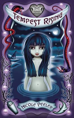
I think this cover also provides a good idea of the sort of read you’ll be getting into. Light, fun, supernatural, not too serious. To be honest, it was a book that I enjoyed at the time so perhaps I should have read more.
Do you have a favourite?
I’ll be updating the list in order to include forthcoming events that I’m aware of so that you can perhaps link your themes up where possible (if you know of an event you’d like to share then let me know in the comments). As always, if you wish to submit an idea then leave me a comment – or if you’d like to host a week then simply let me know.
Next week – A standout font
Future themes: (if you’re struggling with any of these themes then use a ‘freebie’ or one of your favourite covers) (I’ve added some new themes – some of these are slightly different, in order to avoid too much repetition I’m trying to make the themes more of a suggestion that everyone can interpret how they like.
201
2nd October – A standout font
9th October – Mist/fog – “A thin grey fog hung over the city, and the streets were very cold; for summer was in England.”
16th October – Spider web – “Farewell, Aragog, king of the arachnids, whose long and faithful friendship those who knew you would never forget!
23th October – Ripped/torn – interpret it as you wish
30th October – Forest/jungle – ‘None of the Jungle People like being disturbed.’
6th November – Planets – “You’re on Earth. There’s no cure for that.”
13th November – Bright – ‘The future’s so bright, I gotta wear shades’.
20th November – Words only – “Words are pale shadows of forgotten names. As names have power, words have power. Words can light fires in the minds of men. Words can wring tears from the hardest hearts.”
27th November – Modern sci fi
4th December – Fae – or fairy??
11th December – Lake – the mysterious lake
18th December – Highly Stylised
25th December- Freebie – or day off.

[…] was to compare UK and US book covers and decide which is we prefer. This meme is being nurtured by Lynn’s Book Blog and this week we are featuring covers with lots of DETAIL. I’ve selected Just One Damned Thing […]
Oh yes – the cover you’ve chosen is my favourite by far. The overall design is lovely and quirky, and as you say, the reader gets a good sense of the tone and content just by looking at it. I’m always a bit dismayed at how often covers don’t accurately convey the genre.
This is definitely a cover that reflects the style of the book.
Lynn 😀
I like your choice, and also the third cover which is a close-up of the first one, so you can better see the detail of that dog keeping watch 🙂
I like the third one too – it was a close call.
Lynn 😀
I agree – the first one is my choice too ❤️
It’s cute isn’t it.
Lynn 😀
I do love that first cover as well. At first it doesn’t seem busy but if you look closely, there is so much to see😁
That’s why I chose it – I love all the little details.
Lynn 😀
Hi there Lynn! I don’t know this book at all. The first cover has that gothic, comic book vibe. Catchy! I will say it’s my favorite as well.
Have a good weekend, Lynn!
Elza Reads
Thanks – it really is a cover that fits the style of storytelling.
Lynn 😀
This is such a cute cover!
And very appropriate for the story.
Lynn 😀
I like your choice, too!
Thanks 😀
You’re welcome!
Ooh, pretty covers! I like that one 😀
It’s very fitting for the story.
Lynn 😀