Friday Face Off: Exit Party by Emily St John Mandel
 3 April 2026
Filed under Book Reviews
Tags: Emily St John Mandel, Exit Party, Friday Face off


Today I’m returning to the Friday Face Off, originally created by Books by Proxy). I’ve missed these for the past few months and so would like to get back to comparing covers (and hopefully I will be updating this page with a new banner. This is an opportunity to look at a book of your choice and shine the spotlight on the covers. Of course this only works for those books that have alternative covers (although sometimes I use this to look at a series of books to choose a favourite). So, if you have a book that has alternative covers, highlight them and choose your favourite. If you’re taking part it would be great if you leave a comment/link so I can take a look at what you’ve chosen.
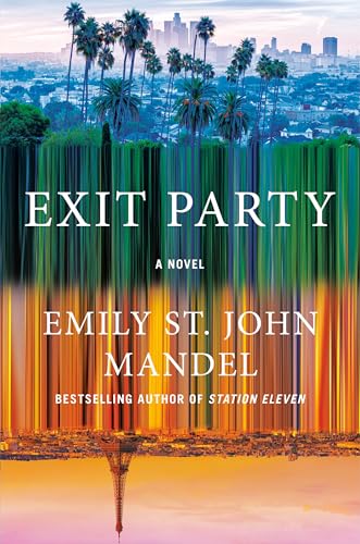
This week I’ve chosen a book that is due for release later this year and that I’m really excited about. Exit Party by Emily St John Mandel. I really like this author so much. Here are the covers:
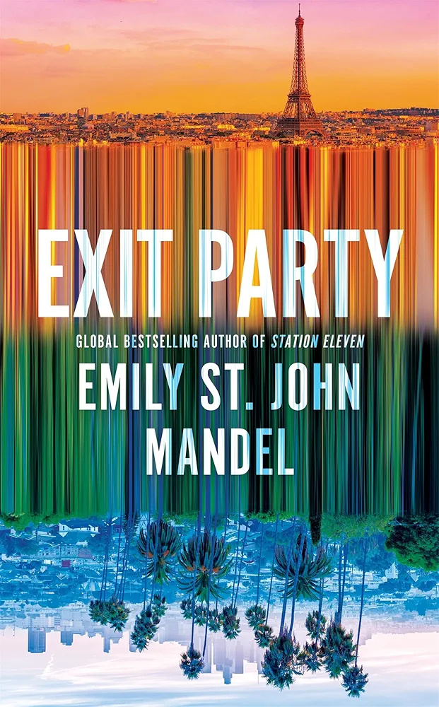
My favourite:
It’s difficult to choose isn’t it? But, I think I like the cover above best and have no explanation as to why that is!
Which is your favourite this week?

I’m beyond excited to read this, and i absolutely cannot chose, both covers are almost identical. I’m curious to see other countries’ covers too when they pop up.
Yes, I’m also curious about what other covers will pop up.
Lynn 😀
Aha, I see what they did there!
I think I agree with your pick, it just looks better with the blue/green in the top half! Plus I prefer the font on that one.
I think at the back of my mind it’s probably because I expect the blue to be at the top of the cover – sky? The cover with the blue on the bottom feels like it’s more akin to water – I’m clearly overthinking!
Yes, the other font is not as subtle.
Lynn 😀
I’m excited to read this book!
Yet, this is one of those times where—to me—the covers are one of the same. I’m sure it’ll make sense AFTER we read the book, but for now there only difference is perspective.
Yes, the only difference is perspective – I don’t think i’d really thought of it quite in that way but absolutely spot on.
Lynn 😀
This is such a hard one to pick. I prefer the font layout of the first one but I quite like how the scene with the sunnier vibes is at the bottom of the second design, it kind of makes me feel like there’s a flipped horizon which instantly intrigues me.
Oh yes, it definitely intrigues me too – well, anything this author writes intrigues me tbh.
Lynn 😀
The difference between these covers is hilarious. I never would’ve thought they’d go there.
…but they did! 😀 😀