Friday Face Off: This Monster of Mine by Shalini Abeysekara
 20 February 2026

Today I’m returning to the Friday Face Off, originally created by Books by Proxy). I’ve missed these for the past few months and so would like to get back to comparing covers (and hopefully I will be updating this page with a new banner. This is an opportunity to look at a book of your choice and shine the spotlight on the covers. Of course this only works for those books that have alternative covers (although sometimes I use this to look at a series of books to choose a favourite). So, if you have a book that has alternative covers, highlight them and choose your favourite. If you’re taking part it would be great if you leave a comment/link so I can take a look at what you’ve chosen.
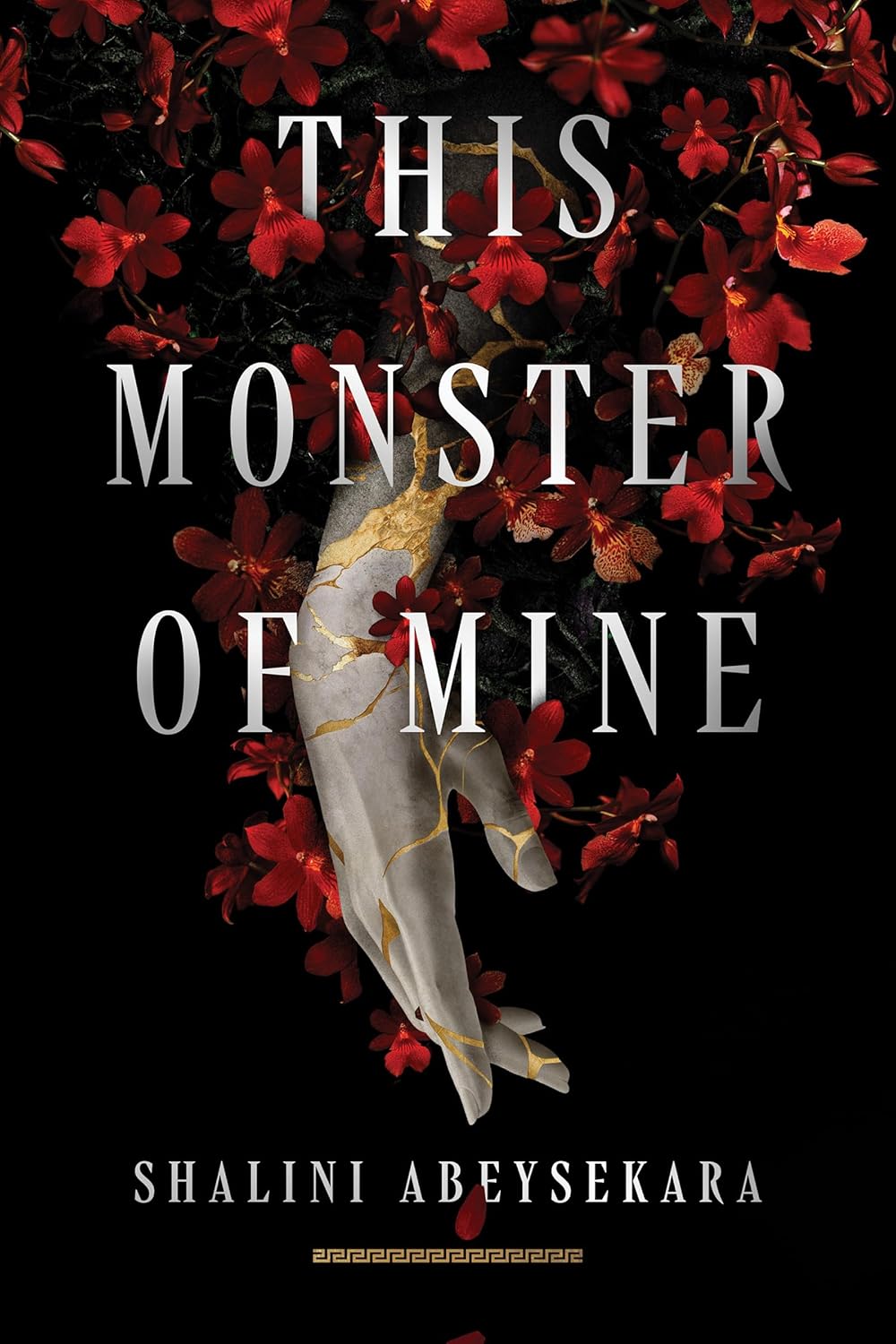
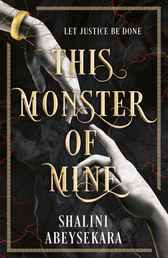
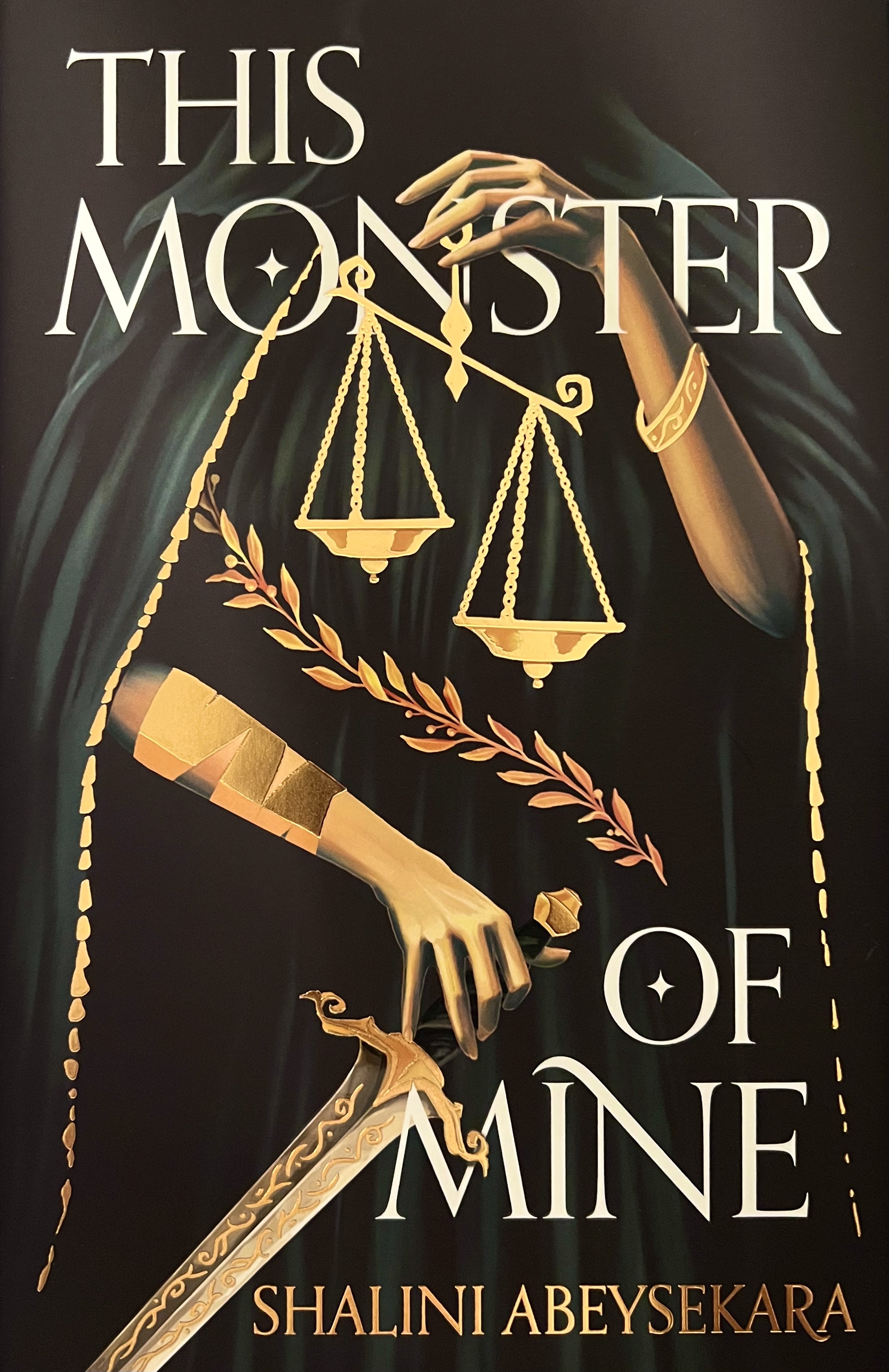
This week I’ve chosen a book that I read last year and I’m now looking forward to the second in series: This Monster of Mine by Shalini Abeysekara. Here are the covers:
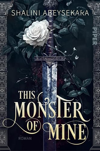
My favourite:
Which is your favourite this week?

I like your choice best as well. The red makes the cover pop😁
Yes, exactly. I do like the other covers but this one stands out and there’s also something very graceful about the hand.
Lynn 😀
I like the one on the lower left. I like the hands reaching for each other and the colors too.
Yes, that one is really nice. It gave me a ‘creation of Adam’ vibe.
Lynn 😀
Yea, exactly! I was trying to remember the reference, but that’s it.
I didnt realise this one had so many covers. My favourites the last one but I think thats at least partially due to me associating it with the Fairyloot (I think?) Edition of it and the gorgeous naked hardback it has beneath the dust jacket 😂
Ooh, that edition does sound lovely.
Lynn 😀
I think the third one (bottom left) is my favourite, but your choice would be my second favourite!
Yes, those two were my favourites, difficult to choose in some respects.
Lynn 😀
Well 4 covers on the same book. The red makes the cover pop. I like that one too I also like the sword though I’d probably pick the red. Thanks for sharing!
Yes, the red adds a lovely vibrancy so even though I like the other covers they’re not as eye catching.
Lynn 😀
It’s interesting how such different designs can come out of a similar concept. My favorite is the one with the scales, but they are all very good.
Yes, that’s a very eye catching design and quite unusual although I can’t put my finger on why exactly.
Lynn 😀