The Friday Face Off: The River King by Alice Hoffman
 6 May 2016
Filed under Book Reviews
Tags: Alice Hoffman, Books by Proxy, The Friday Face Off, The River King


Here we are again with the Friday Face Off meme being hosted by Books by Proxy . This is a great opportunity to feature some of your favourite books covers. The rules are fairly simple and can be found here. Each week, following a predetermined theme choose a book, compare a couple of the different covers available for that particular book and choose your favourite. Simples. This week the theme is:
You Got The Blues
A cover which is predominantly blue
I had no idea how many blue covers were out there! Wow. Just wow!! The book I’ve chosen this week is from an author I really enjoy reading.
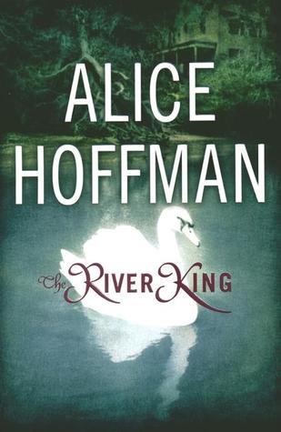
Alice Hoffman’s The River King with three covers as follows:


I’m not overly fond of the hands and fishes cover to be honest. The blurred middle cover – I like the yellow font and the layout. I think my favourite, even though it’s more green than blue is the third cover with the swan: This week’s winner:
Join in next week when the theme will be:
Which Witch is Which?
A cover which features a witch and/or witchcraft

I prefer the one in the middle – the slight blurring feels mysterious and the overall effect is rather beautiful, and you’re absolutely right about the effective yellow font! This is my bluuuuue offering today… https://sjhigbee.wordpress.com/2016/05/06/friday-faceoff-you-got-the-blues/
I think the font is lovely and really effective.
Lynn 😀
I agree, that’s my favorite too. Except it’s green, lol.
Yeah – it is good – but green! Still…
I like the first one.
Haha, I really can’t get my head around that one at all. And in fact I have this book and I don’t think that any of the covers I found are the one I own.
Lynn 😀
Definitely with you on this one. I love that cover! It’s actually quite simple but works very well. I spy a bit of blue in it too 😉
Yeah, – there’s a bit of blue – and I’m sure my book is totally different to these I have in the post but I couldn’t find it!
Lynn 😀
It’s hard for me to judge since I’ve not read the books, but I think it’s a tie between your choice and the middle one with the yellow font. Are the white shapes on it meant to be whales? Swans? Hard to tell without reading it!
It’s a good book that I read ages ago – and before I started blogging so no review. But I enjoyed it. It has a kind of bullying, school setting type of feel. I think the figures are meant to be a bit ambiguous – I do like the yellow font but overall I prefer the greenish cover – although, now I think about it I wonder if that’s the one I would pick up in a store or whether I’m being influenced by already having read the book – that’s interesting. I never thought of that before! I need to have a think about that now.
Lynn 😀
I agree with you on this. I prefer that cover. The one with the hands is a little creepy.
Yeah, it looks definitely creepy when you first glance at it – until you look up close!
I had a hard time choosing, since none of the covers really stood out to me at first glance, lol. But ultimately I have to agree with your choice. Can’t go wrong with a swan 🙂
Haha – definitely can’t go wrong with a swan – unless it’s chasing you!
Lynn 😀