‘I found Rome brick, I left it marble..’
 15 April 2016

Here we are again with the Friday Face Off meme being hosted by Books by Proxy . This is a great opportunity to feature some of your favourite books covers. The rules are fairly simple and can be found here. Each week, following a predetermined theme choose a book, compare a couple of the different covers available for that particular book and choose your favourite. Simples. This week the theme is:
Metropolis
A cover which features a city
This week I’ve gone for the City of Stairs by RJBennett. An awesome book with two completely different covers today:
UK : US


These two covers really couldn’t be more different even if they tried and they both have their merits. I love the colour in the Uk version and even the way the tower makes up part of the text. The US is very moody and more modern looking somehow. However, for me this week the winner is:
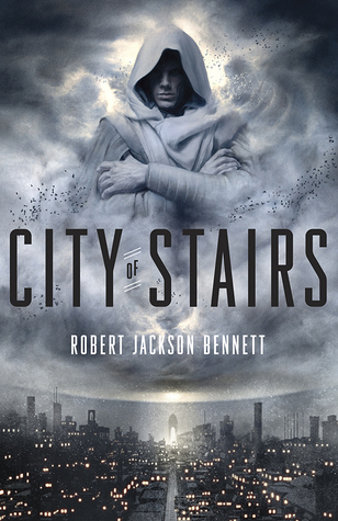
Maybe I’m just indoctrinated into the whole ‘people with hoods’ on fantasy covers but this is the winner for me without doubt. I like them both and even though this cover has less dramatic colour the whole moody sky and bright city below just pulls me in.
Come join us next week when the theme will be:
Dead Men Tell No Tales
A cover which features something or somewhere relating to death
(between you and I, I have at least three different books that immediately spring to mind with this one!)

I almost did the book too! I actually had it (US) in my hands when I saw Mitosis and decided that one instead XD
I actually really like the simplistic design of the UK versions, but that white hooded and cloaked figure over the city – way to epic to not like 🙂
Here is my Friday Face-Off: http://wp.me/p53gyJ-2Vk
I was going to do the Lies of Locke Lamora first – because Venice! But then thought I’d use this instead.
Lynn 😀
Definitely the US version…It looks like the Aragonath in The Fellowship of the Rings.
Yeah, that’s what I thought too.
Lynn 😀
I like both of these but I think I’d go for the US cover. I really like the simplistic design of the UK cover but that figure really draws the eye! Love that atmospheric sky too. Great choice!! 😀
It is very atmospheric – and you have to love a hooded figure!
Lynn 😀
The hood always wins…. 😀
My feelings exactly – it’s a pre-requisite!
I definitely prefer the UK cover for this one. 🙂
Nice to see somebody in the UK corner this week! I do love the colour and the way the font is worked and it has a very ‘clean’ style.
Lynn 😀
I like the US cover, but the UK cover is pretty nice too!
They’re both good – I just have a slight preference for the US one – it could just be the one I relate to more because I saw that cover first.
Lynn 😀
I love your choice of book to feature! It’s perfect, especially since the covers are so different but both are striking. I’m having a hard time choosing, to be honest. If push comes to shove I probably have to give the edge to the US cover, but I really love the simple yet elegant art style of the UK cover.
I really like both – funnily enough they look like they could be completely different books don’t they! I think I maybe prefer the US cover because it’s the one I really associate with having seen it so much on the blogosphere before release.
Lynn 😀
I find both appealing in their own way. I like the US cover for its color and that the city silhouette reminds me of paper cutouts. And I like the UK cover because of how moody it is, as you said, and the dude in the hood makes me think of marble statues.
Haha, yes, he does have a marble statue kind of feel.
While I get the whole dramatic hooded figure on the US cover, I think I would have to go for bold blue and the outline of the exotic looking city on the UK cover.
It is lovely isn’t it! I just have a ‘thing’ for hooded characters on SFF books!
Lynn 😀